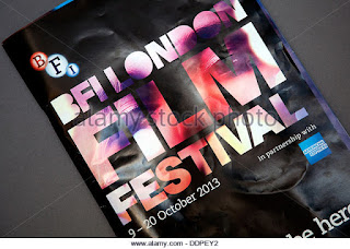
In this BFI brochure the front cover show a title of publication where the central image is incorporated in the central image the colour scheme matches the BFI logo so their is a consistent colour scheme throughout. furthermore, there is a date of publication where it shows what date the BFI London film festival is so that people would understand when this event is taking place. in addition, it has name checks where it shows who they are partnered with which is american express this gives the audience a sense of the target audience which would appeal to the more wealthy people.

in this brochure there is a consistent colour scheme with white black and red. This is simple but the use of the red is eye catching to the audience which makes them more likely to read the brochure.
This brochure has a main central image where that is the focus point so this is simple but also affective so that it doesn't make the brochure have too much going on.
in this contents page it is affective due to the use of the images so that the target audience know what may be in the magazine
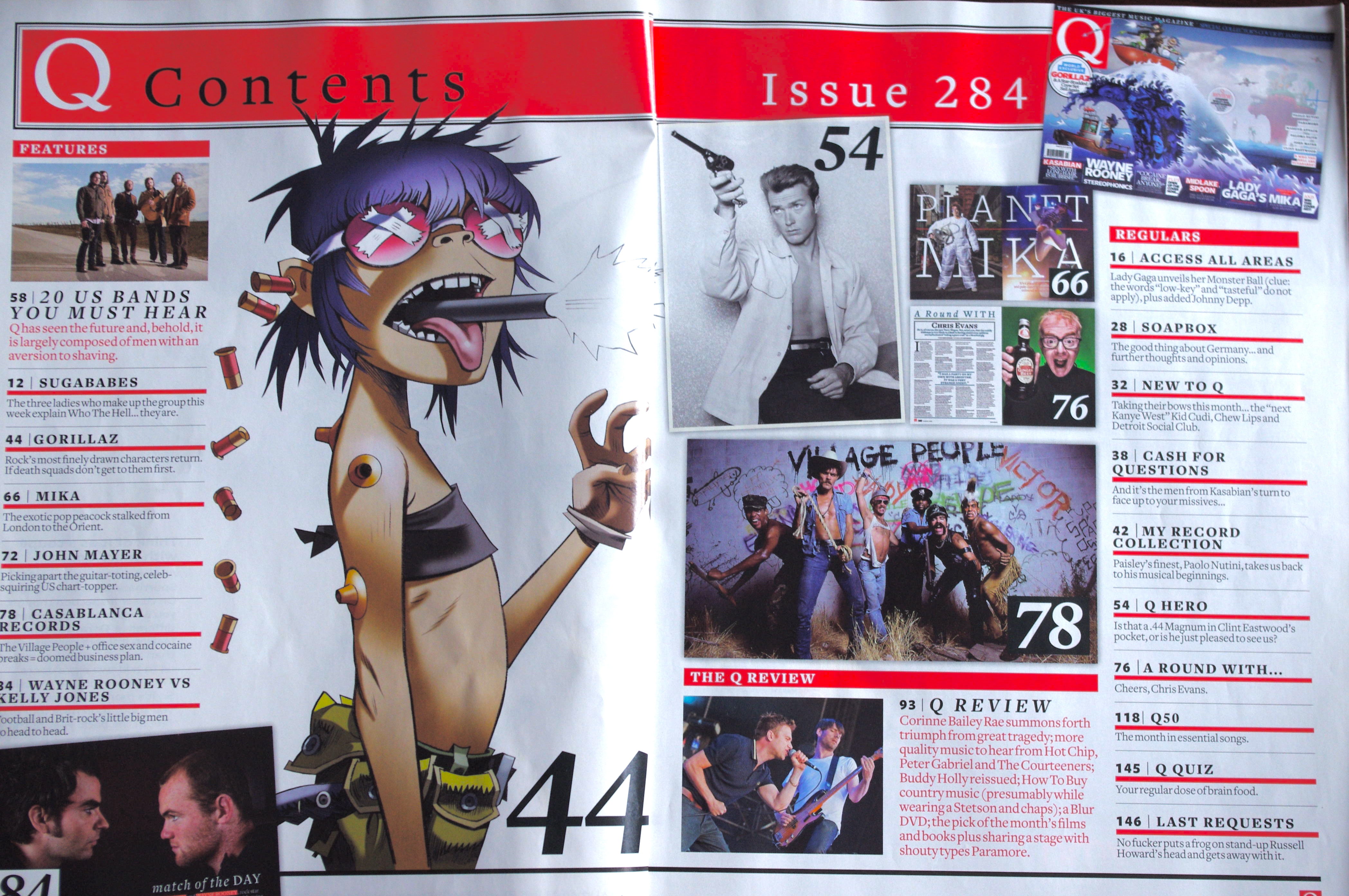
It has lots of images and information and images of different brands are all in one page. Images are a short way of putting messages all into a short amount of space.

the colour scheme has a look of the film magazine to look luxurious which is eye catching to the customers due to the blacks and the gold.
in this program the central image is of a person the has paint covered over his face which adds colour and excitement to this program.
this image is the BFI which incorporates the central image with the title.
No comments:
Post a Comment